GP RENEVABLES
Brand design system
Catalogue
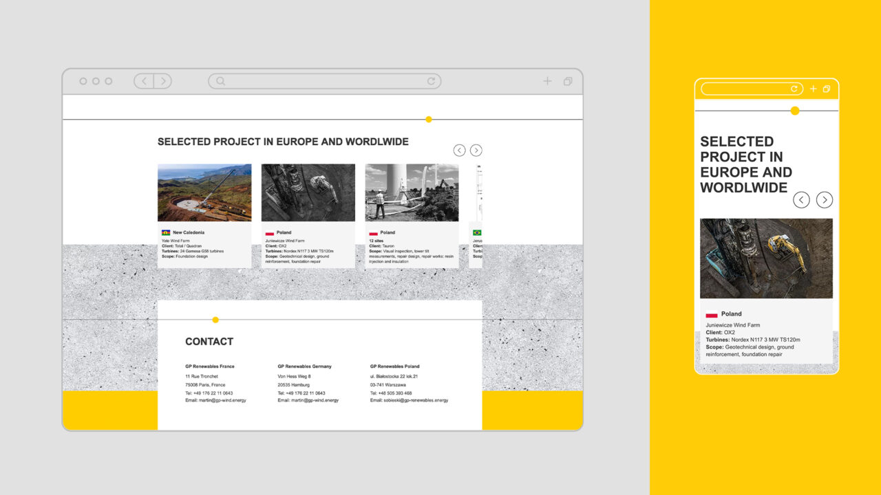
Web design
GP Renewables design, builds wind farm foundations. They also carry out inspections and repairs working around the world. They’re ingenere experts with great technology and high standards.
Challenge
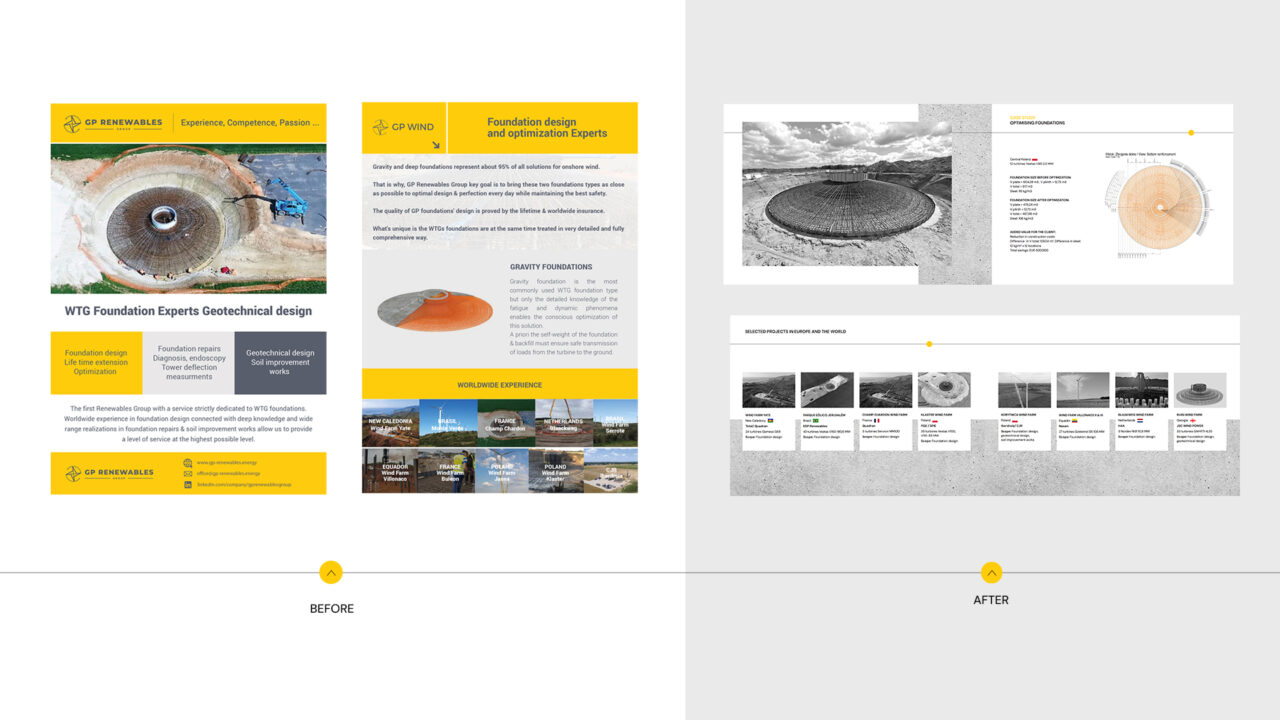
They faced a common problem shared by many technical companies: their deep expertise was getting lost in complex, inconsistent and outdated communication.
The renewable energy sector is crowded with technical jargon and similar-looking brands. GP Renewables needed to stand out while maintaining credibility with engineering partners and investors who demand serious but accessible and clear presentation.
Solution
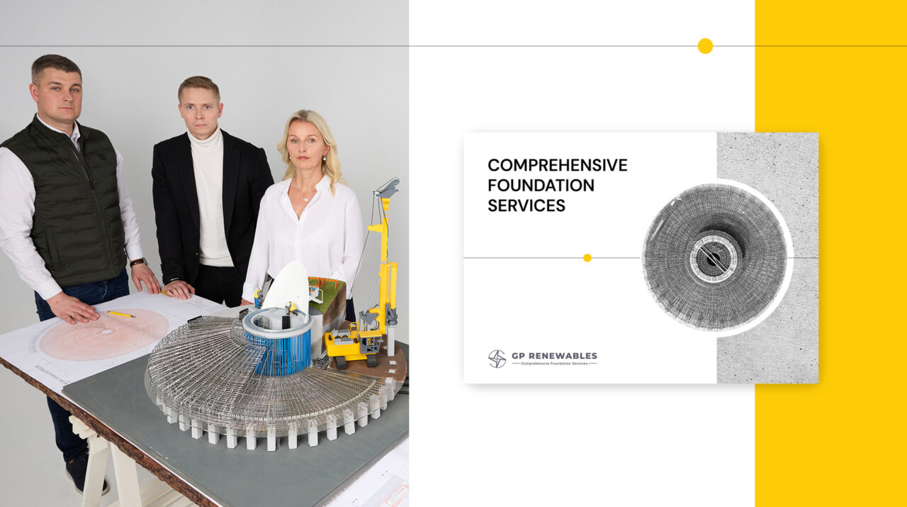
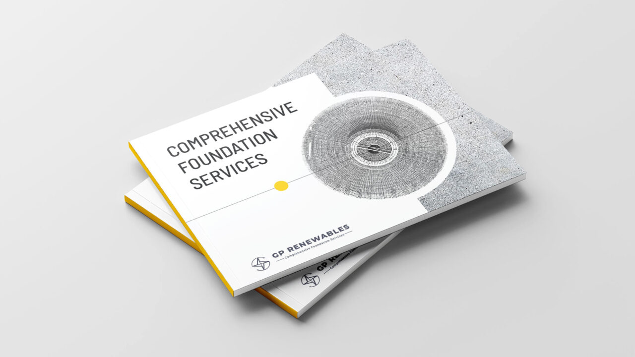
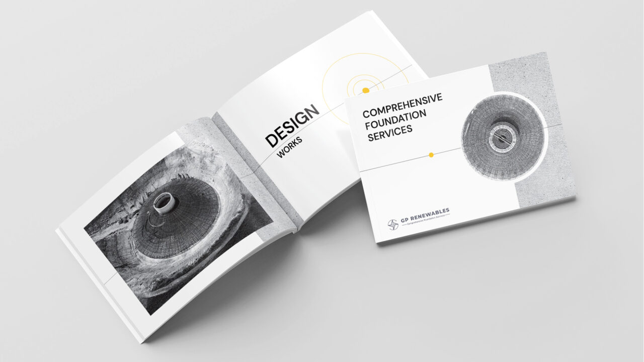
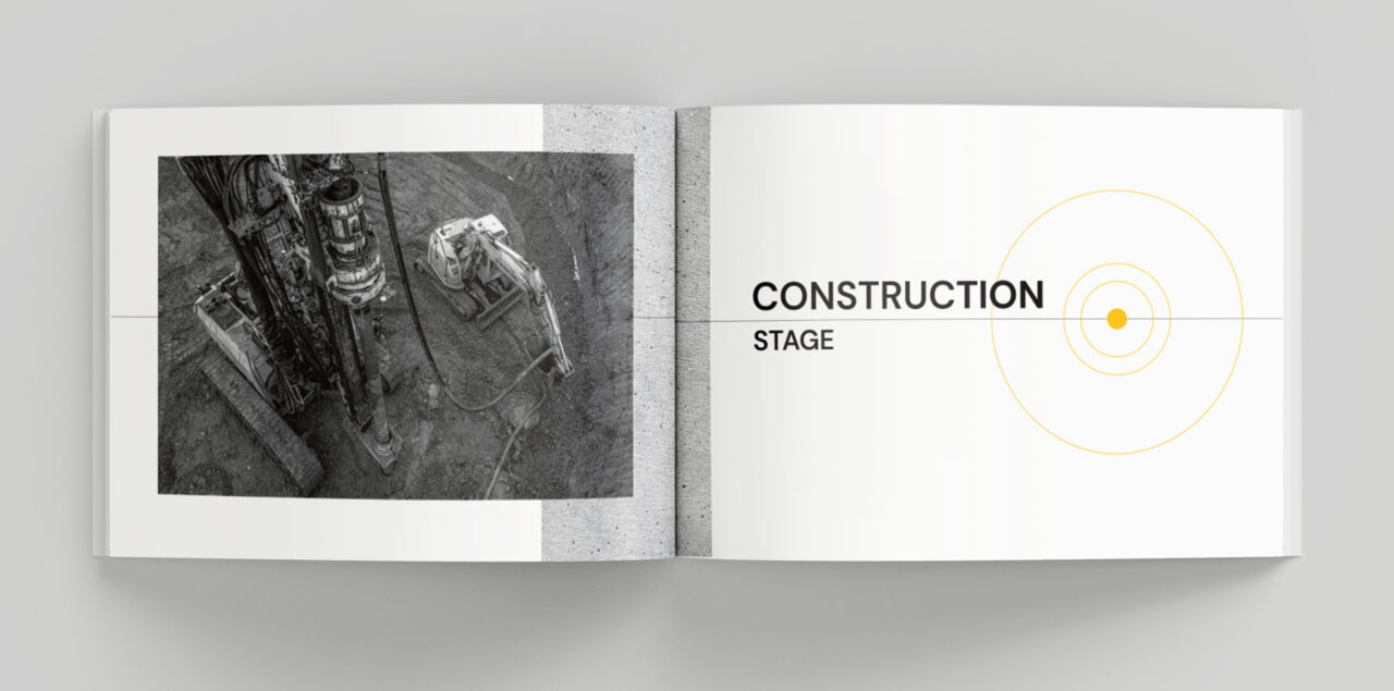
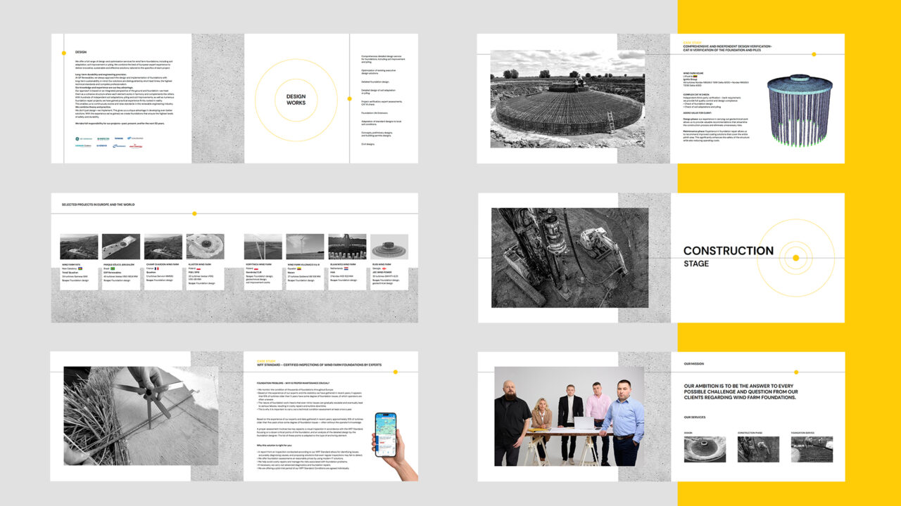
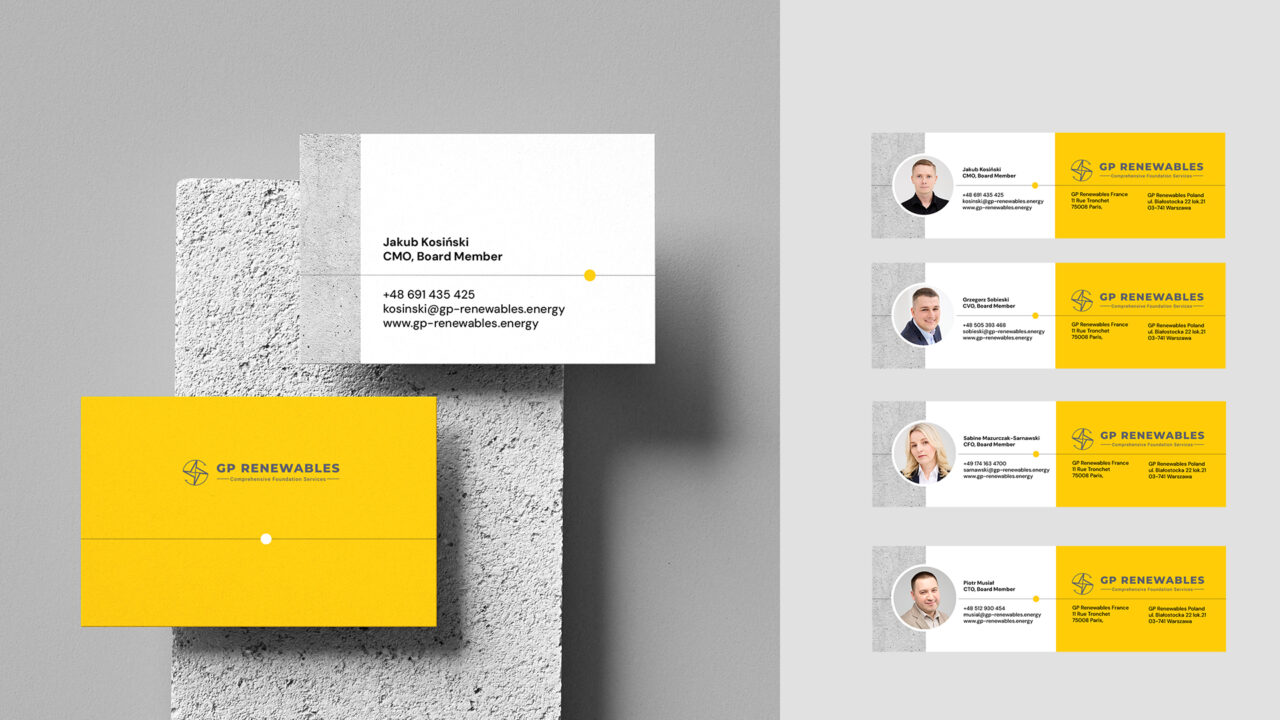
I developed a new coherent visual system for their catalog, website and social media. The goal was to take their highly technical services and distill them into a clear, professional communication that truly stands out in their niche.
I crafted a visual language (keeping brand colours – yellow and grey) that is modern, simple and deeply rooted in their core business while maintaining technical credibility.
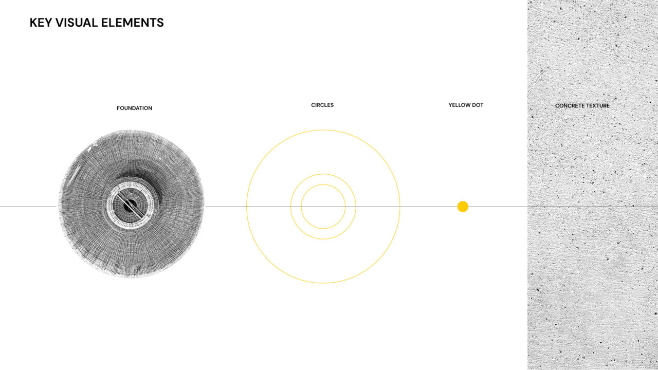
Key elements include:
Yellow dot accent: A unique brand identifier adding distinction to the clean aesthetic.
Outline circles: Reflect foundation shapes for instant recognition.
Technical lines: Symbolizing precision and expertise in engineering.
Concrete texture as a background: A characteristic, authentic material connection.
Monochrome palette: black and white photos ensuring sophisticated consistency.
Results
Professional credibility: The brand now matches their engineering precision
Clear communication: Complex services became easy to understand
Standing out: A distinctive presence in a crowded technical field
Trust building: Clean, modern design shows reliability and innovation
New visual identity not only reflects their high professional standards but also makes highly technical information clear, simple, and approachable. The design looks clean, modern, stylish, and bright, what creates trust and credibility.
Whether you’re engineering wind farms or engineering better health outcomes, the principle is the same—your brand deserves design that highlights your expertise. Your innovation is too important to be hidden behind complex communication.
Great design isn’t about making things pretty—it’s about making complex innovation accessible, trustworthy, and human. GP Renewables’ transformation proves that when you align visual communication with technical excellence, you don’t just look professional—you become the obvious choice.
Ready to transform your innovation into a brand that builds trust at first sight?