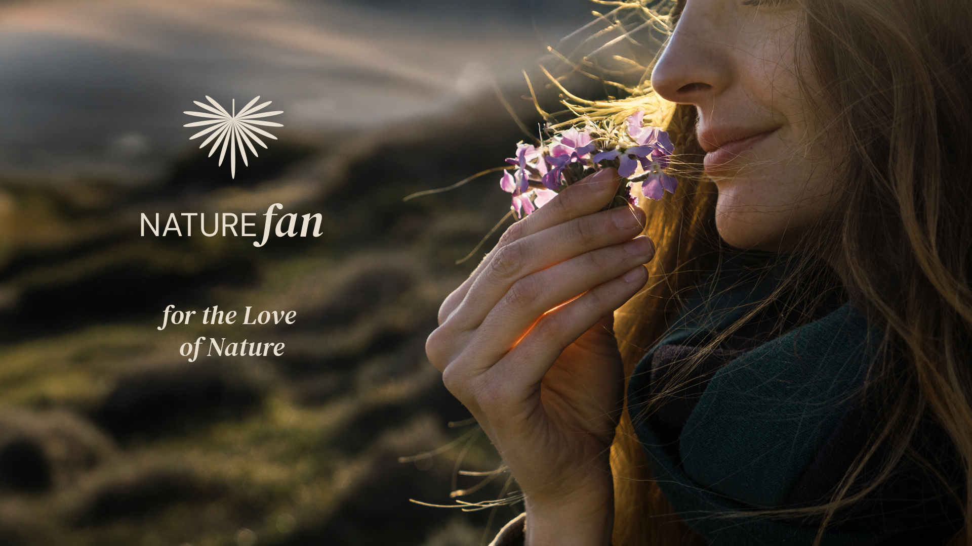
Nature Fan
Branding
Naming
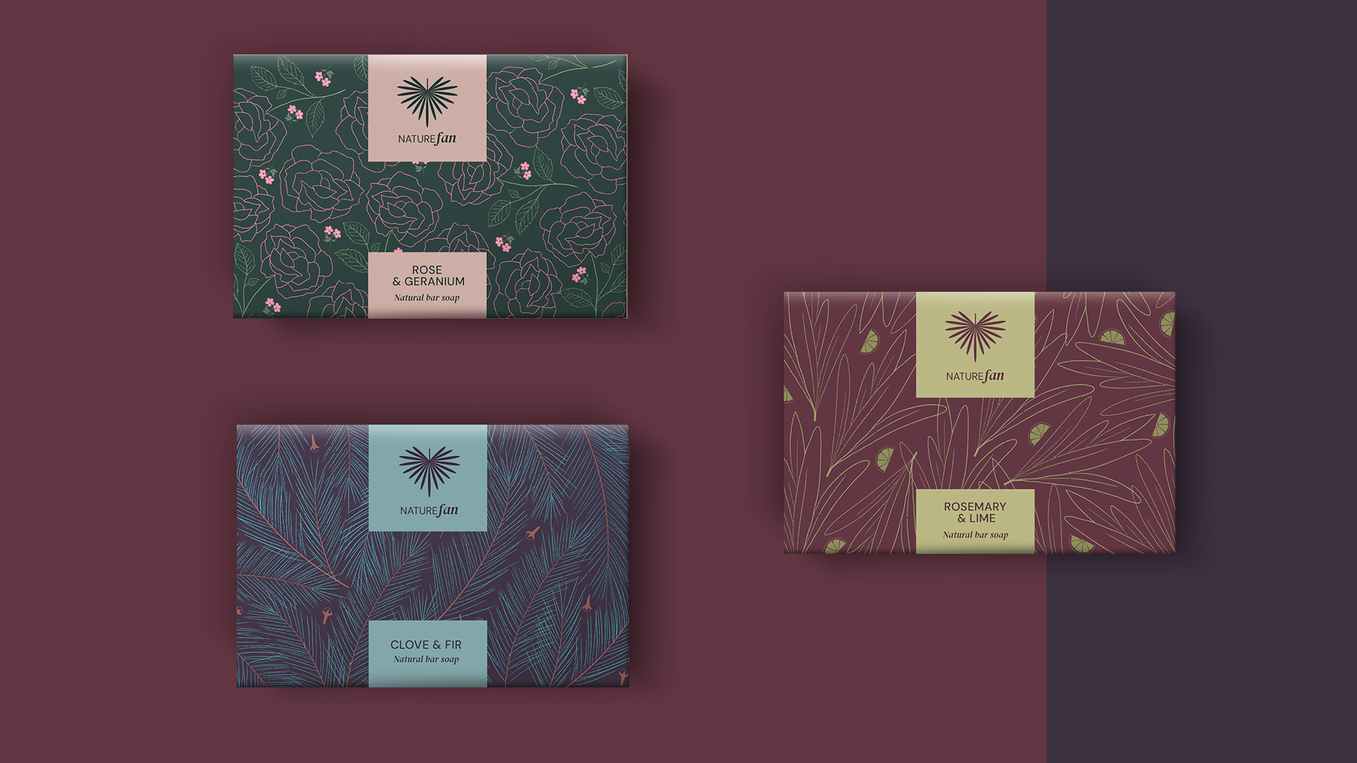
Illustration
An organic and vegan soap producer was entering the overcrowded natural cosmetics market. They had exceptional premium products—crafted soaps made with high-quality natural ingredients—but no brand identity to communicate their uniqueness.
The natural cosmetics category is flooded with bright colors, predictable green palettes, and surface-level nature messaging. Every brand claims to be “natural” but few create genuine emotional connection.
Challenge
Create complete brand identity—name, logo, and visual language—that would resonate with true nature enthusiasts who seek deep, intimate connection with the natural world.
Target audience
Nature enthusiasts who make conscious choices, seek products with natural ingredients, and love spending time outdoors. People who want authentic connection with nature in every aspect of their lives.
Solution
I built a brand that speaks directly to nature’s most passionate advocates:
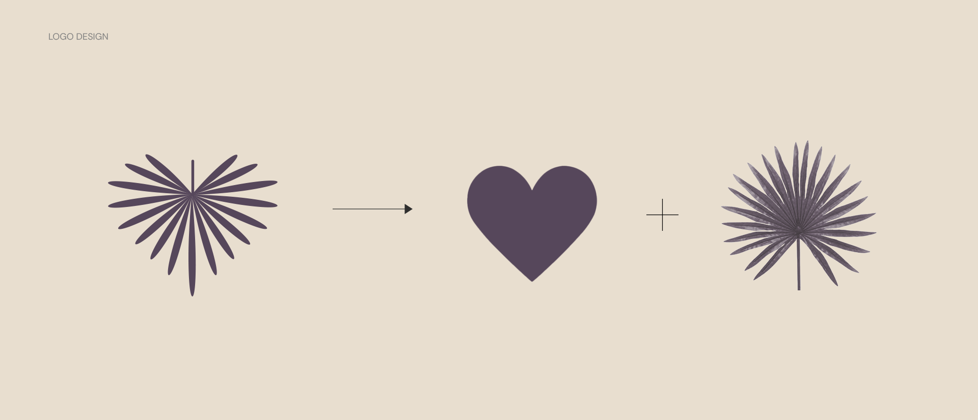
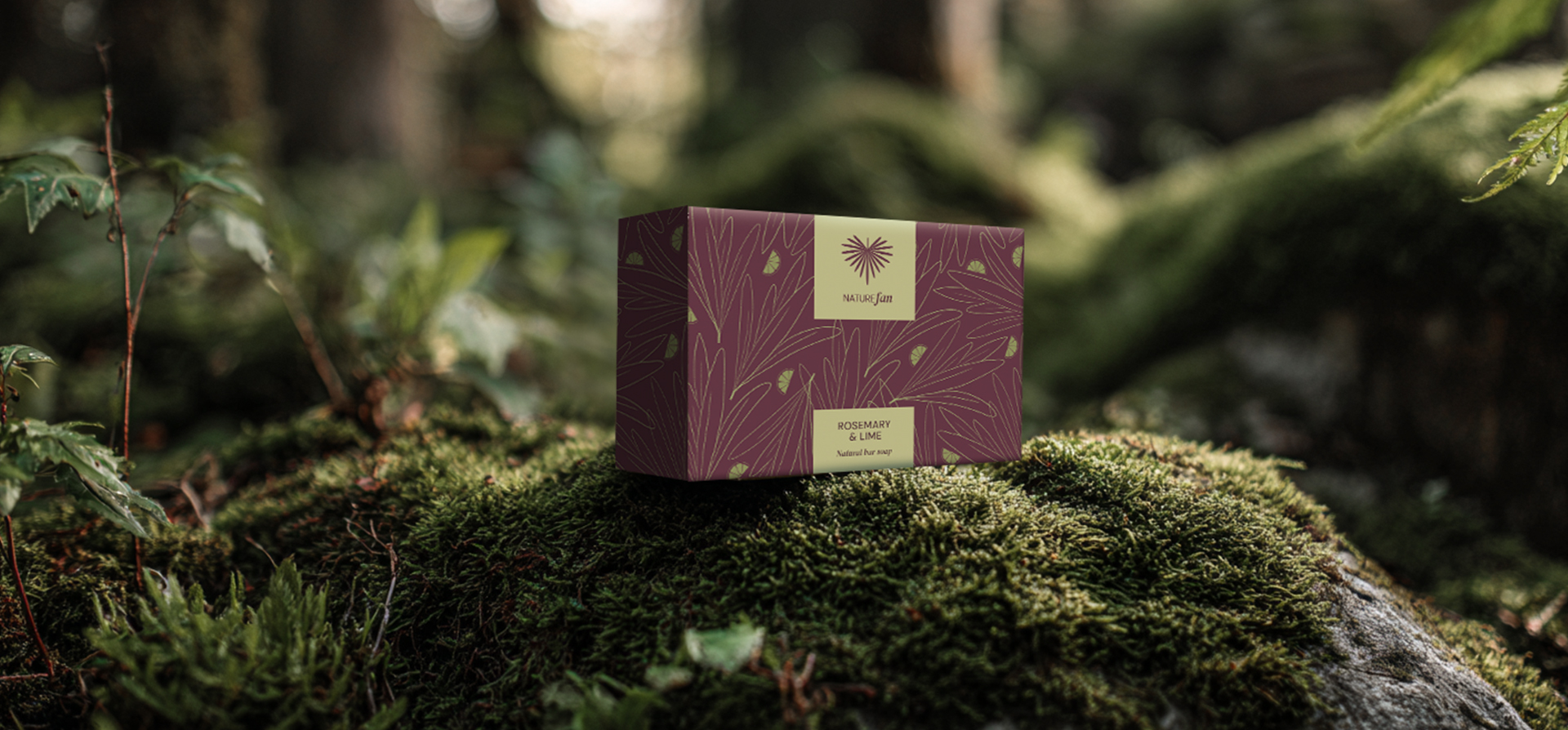
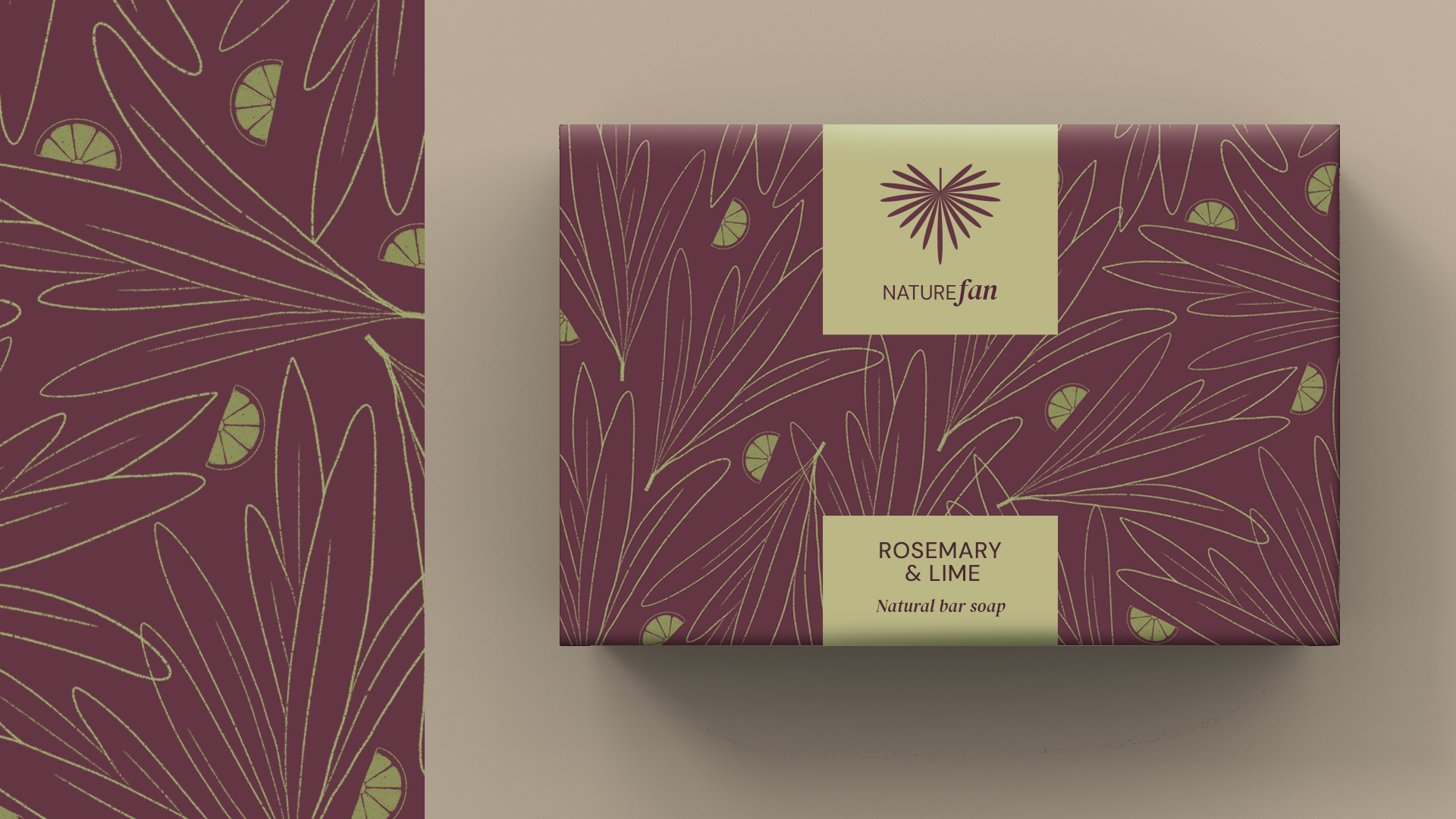
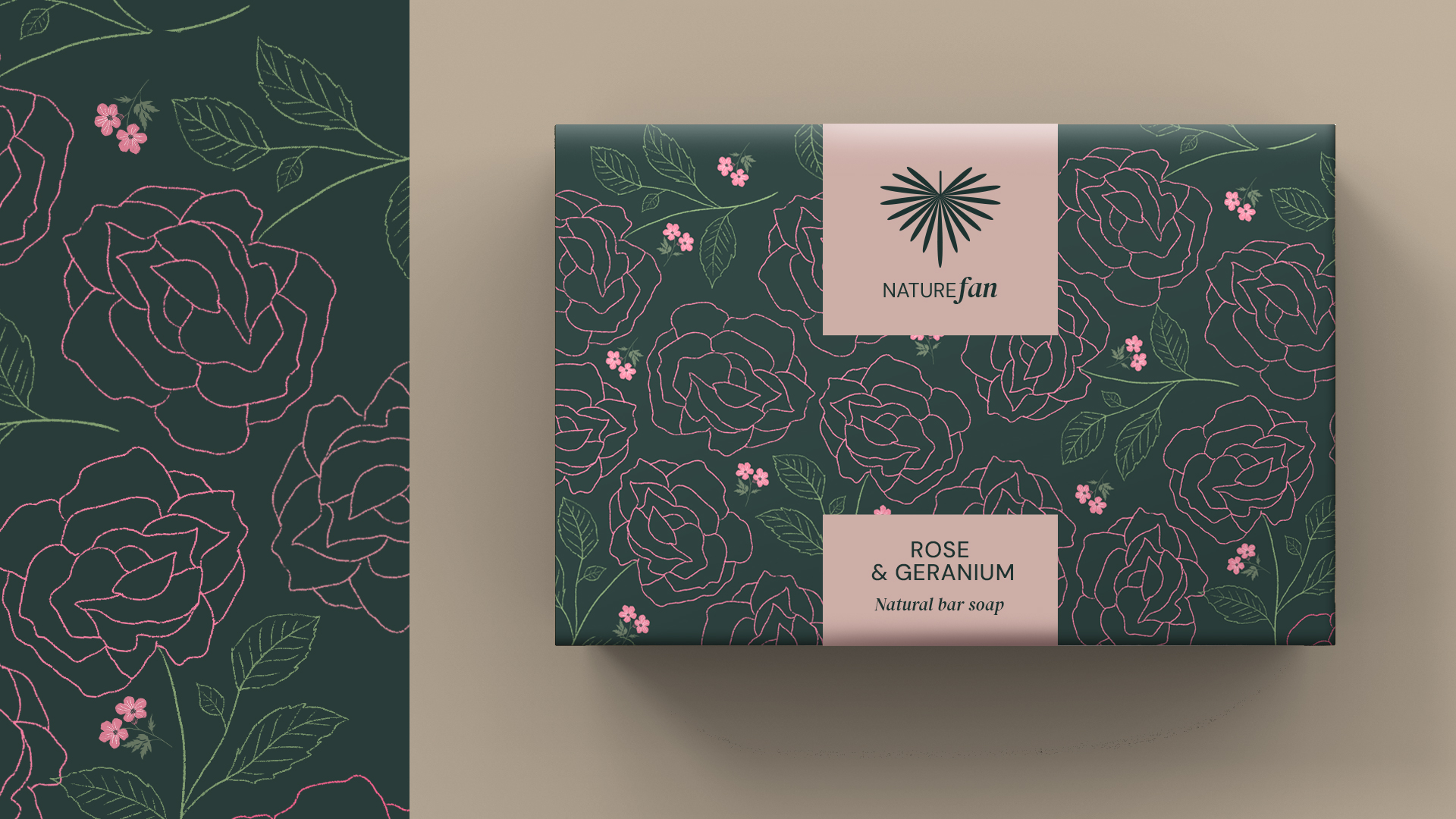
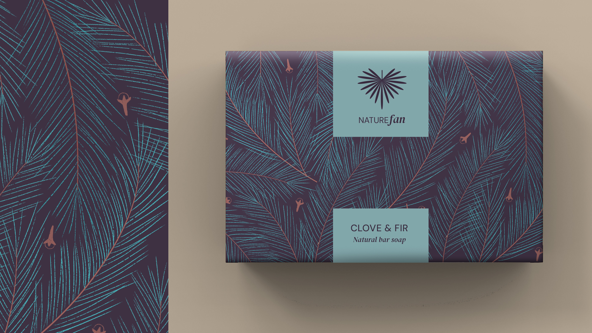
Naming: NATURE FAN—directly addressing their core audience. The name immediately identifies who this brand is for: people who aren’t just casual consumers but genuine nature enthusiasts.
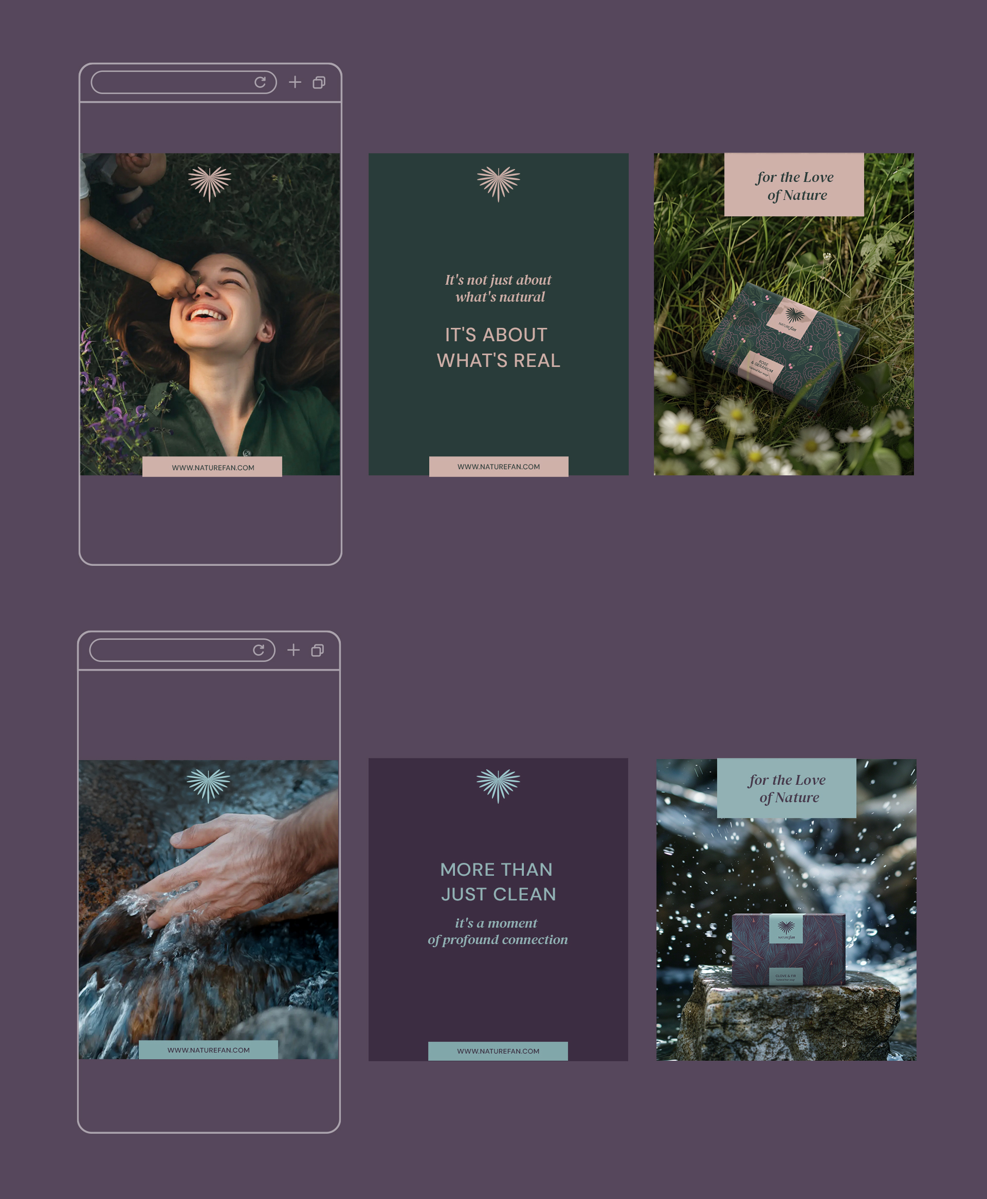
Logo design: I leveraged the dual meaning of “FAN”—both enthusiast and palm leaf shape. The symbol: an inverted palm leaf shaped like a heart, representing love for nature in its most intimate form.
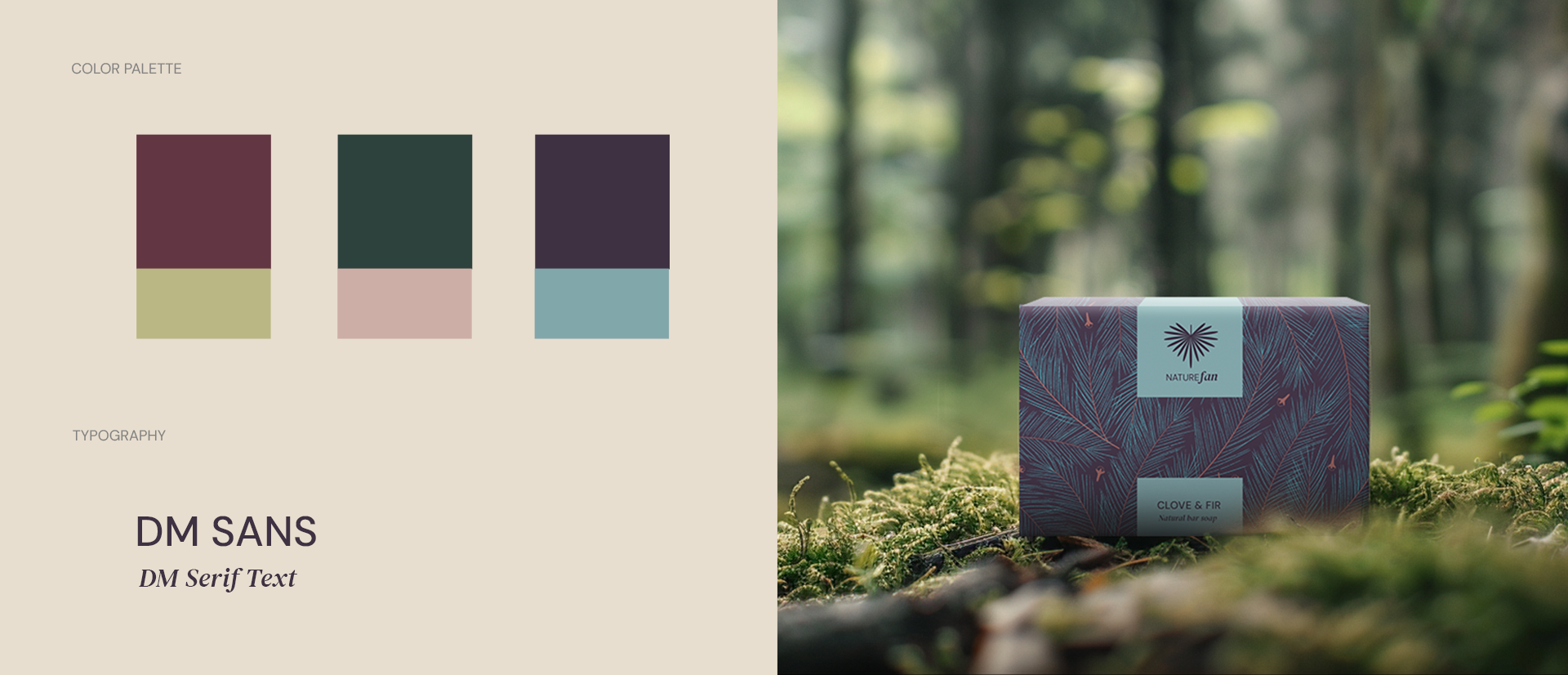
Distinctive color palette: Instead of bright colors, typical for the category and omnipresent green, I chose deep, dark, earthy tones. These colors create an atmosphere of intimate nature connection while distinguishing the brand from cheerful, surface-level competitors.
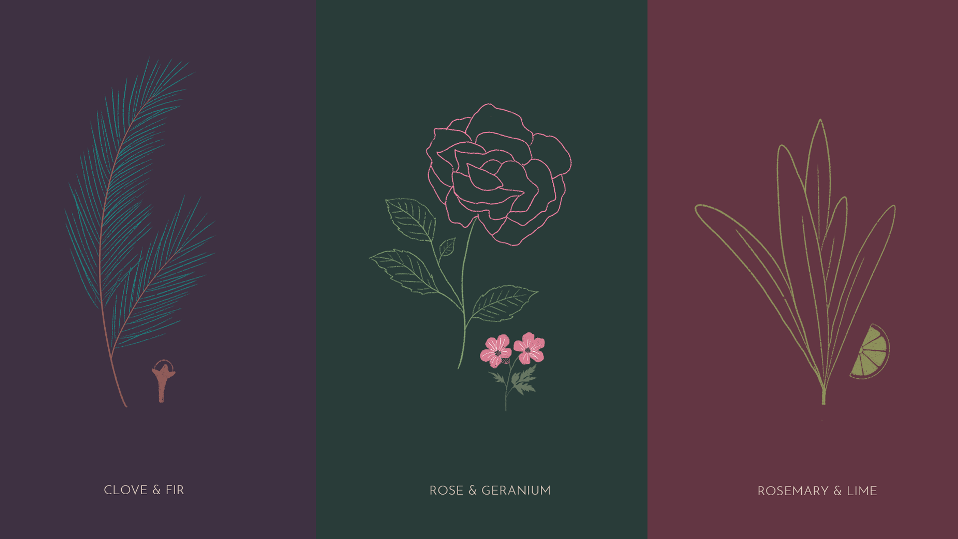
Visual communication language: True nature lovers seek deep connection, not superficial messaging. The photography direction emphasizes intimate contact: close-up shots, natural textures, tactile experiences. Custom illustrated patterns emphasize authenticity.
Typography:
The combination reflects both modern consciousness and timeless nature connection.
Simple sans serif for stability and clarity.
Serif italic for warmth and tradition
Results
Instant Recognition: Each sport category now has clear visual identity
Efficient Communication: Modular system speeds up content creation
Modern Appeal: Fresh, contemporary look that attracts audiences
Operational Efficiency: Easy editing saves time and resources
This project demonstrates a crucial principle: systematic visual organization builds trust and recognition.
Whether you’re launching multiple health solutions or diverse wellness programs, systematic visual identity creates immediate understanding and trust.
Building coherent visual identity systems isn’t just about aesthetics—it’s about operational efficiency. Great design solves real problems. The Municipal Sports Center proves that when you organize visual chaos into systematic clarity, you don’t just look professional—you become more efficient and trustworthy.
Ready to transform your complex offerings into clear, systematic communication?